Branding + typography
6 individual projects
2023 Plnu
senior poster
-
I decided to do an in-depth illustration in my favorite style of detailed line work. I chose to base my illustration off of the quote “to the ones with their heads in the clouds”. I went for a children’s book theme and drew on my own childhood for different characters and outfits. My goal was to make it feel nostalgic as the senior class leaves school and enters the real world to become the people that they are intended to be. The quote is to encourage students to stay gold and never lose the child inside of them, instead allow it to set morals and roots for their future.
-
Create a poster for the senior class of 2023 that encompasses everyone and our future as designers.
-
Started by researching different approaches to the project, compiled a mood board, and started sketching the idea. Created the refined illustration components and combined them in indesign
-
Client: PLNU Department of Art and Design
Category: illustration, typography, poster, design
Deliverables: Poster, Postcard, Facebook and Instagram
poster deliverable
Post card deliverable
Facebook deliverable
bodoni typeface poster
-
I did many type studies focusing on alignment, hierarchy, and extreme scale. I styled the type to support meaning, hierarchy, and create contrast. The modular grid helped to organize and structure the compositions. Multiple iterations were done. Next, I wanted the type to blend harmoniously with the varied backgrounds images using layering techniques and contrast. I took two different approaches to this assignment—one more traditional and the other more experimental.
-
Create a poster highlighting the typeface bodoni. use hierarchy, contrast, and movement to make a balanced dynamic composition.
-
Designed multiple type studies and researched imagery. Created experimental layouts using a modular grid.
-
Client: Bauer Type Foundry
Category: Typography, Layout Design
Deliverables: Two, 18” x 28” Posters
poster deliverables
corporate transparency awareness campaign
-
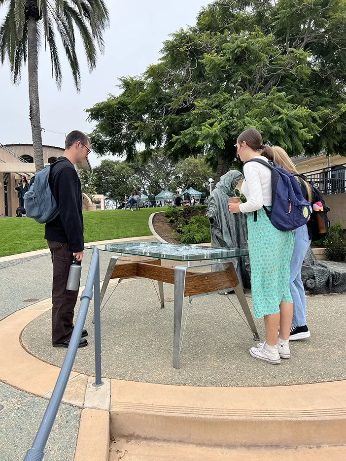
I took many different approaches to solving this challenge using mostly recycled materials. I used my illustration skills to draw on an existing glass table with white ink. The main concept was exposing large corporations and creating more transparency through questions and providing facts. I took the tarot card Le Judgement for inspiration. I wanted to illuminate how large corporations sometimes use ethics that harm the environment and people. I included factual information hidden all throughout the illustration in a type style that is cohesive with the drawing.
-
Use design thinking human-centered research methods to create an interactive design that spreads awareness about climate change and its social impacts. installations will be publicly displayed during creation care week. The design must be feasible, viable, and desirable.
-
Completed research on the topic “corporate transparency.” Compiled information and designed the illustration. Laid a print out of the illustration under the glass and trace over with paint pens. Added free hand lettering as the final details.
-
Client: Creation Care Week
Category: Illustration, Design, Interactive Art Installation, and Social Impact
Deliverables: Detailed interactive illustration painted onto a glass table that displays the lack of corporate transparency among large businesses.
8 page publication
-
This is a passion project on fighting addiction. It is one of the growing concerns among my generation and is extremely important to talk about. I decided I wanted the publication to feel personal. Type is hand written with a typewriter font that compliments my handwriting. I used a modular grid to create organization and consistency throughout the pages.
-
Create an 8-page publication on a passion of your choosing and present it using hierarchy, type styling, and organization.
-
Started by writing all of the text. Found imagery that compliments the writing and arranged elements in a balanced multipage system.
-
Client: Recovery groups and in-patient houses
Category: Design, Publication, Creative Writing, Typography
Deliverables: Eight page publication
brand manual company: acacia
-
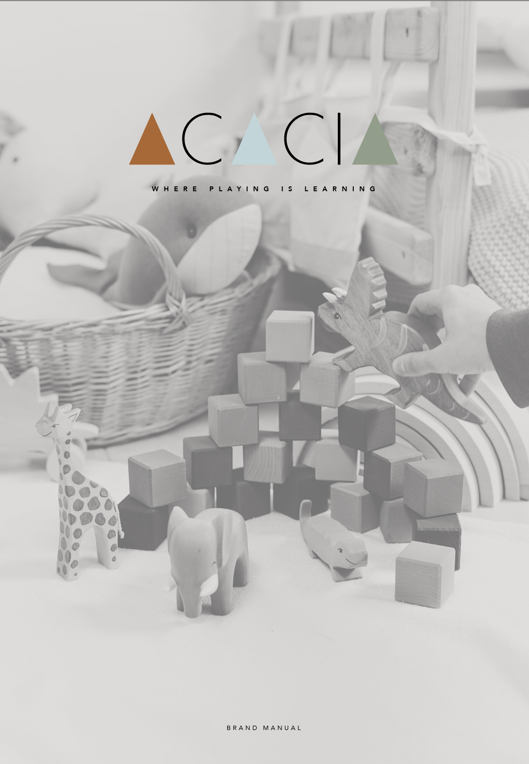
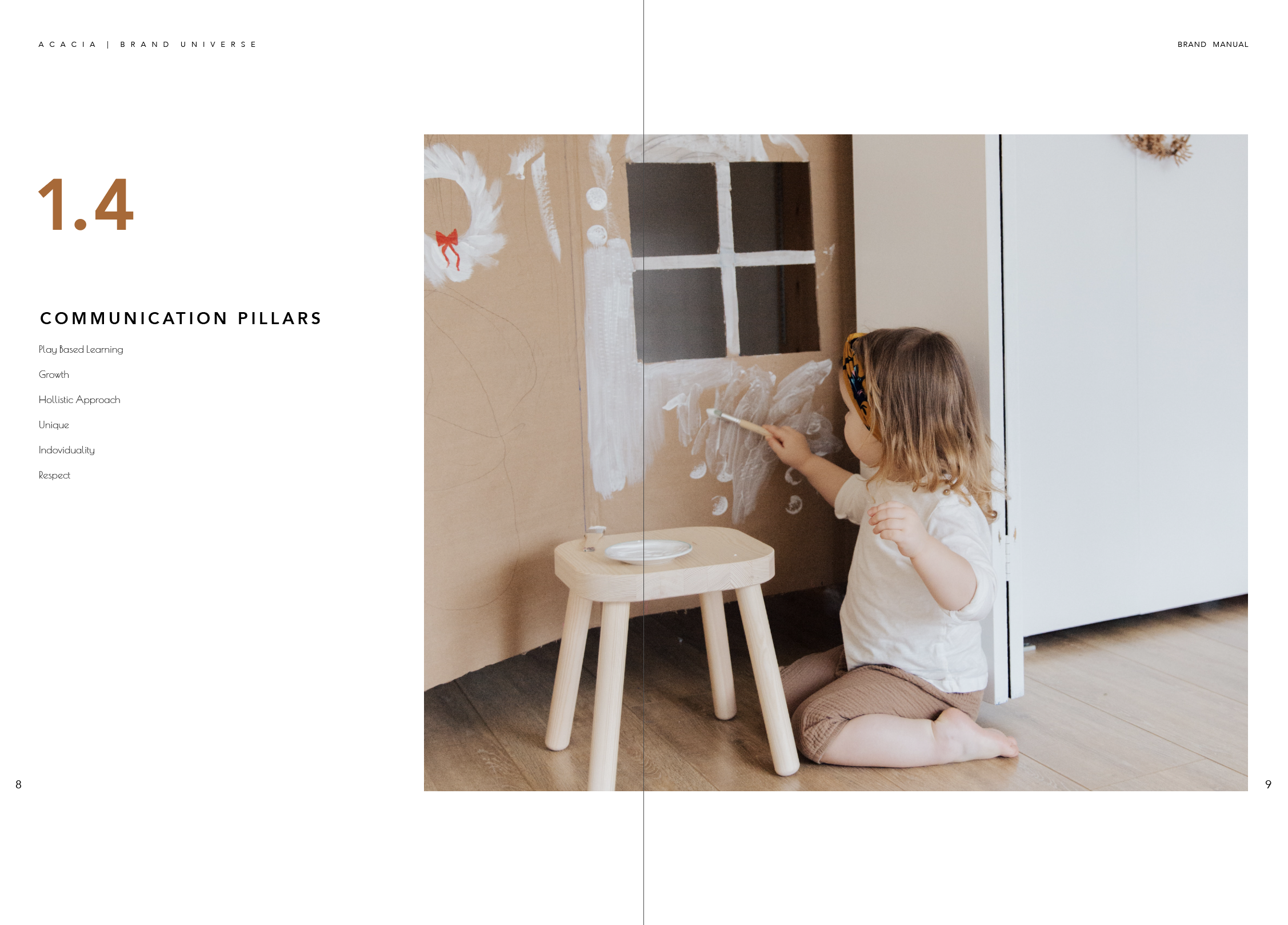
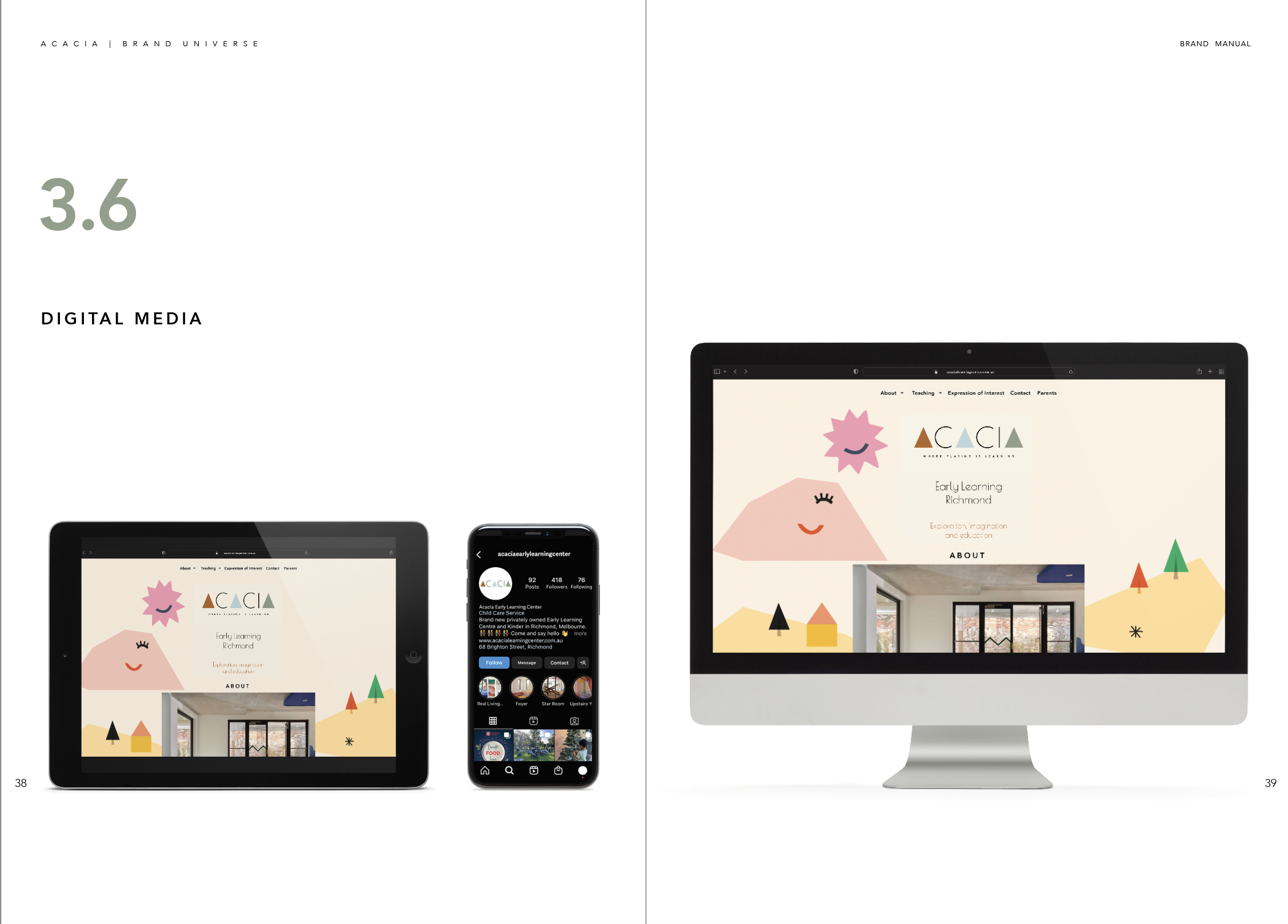
Brighton Street is an early learning center in Australia. I completed background research, analysis to understand who they are and what they stand for. Based on the information, I created names and taglines that would communicate their brand essence. Next, I designed three creative directions, with many variations, then narrowed my choices. The best primary identity was applied it to all brand touchpoints like: business stationary; ephemera; website; environmental signage; and a vehicle. The brand manual serves as a guidebook of who they are, what they stand for and how to correctly use brand identity system across media.
-
Rebrand an existing early learning center
-
Created a brand identity that aligns with the organization, the learning center environment, and appeals to the target audience. Created a brand manual with the primary identity applied to all brand touchpoints.
-
Client: Brighton Street Early Learning Center
Category: Branding and identity program
Deliverables: Brand Manual and New Logo
personal brand
-
The process of creating my own brand identity led me to dive deep into who I am as an artist and a designer. I kept coming back to my weird illustrations that I love to create and decided that the best way to represent me was to do what I love. I wanted there to be bright colors and organized chaos. I love art that feels like a treasure hunt. The longer you look at it the more you see. That was the goal for my business card. As an artist myself I don’t just have one style of art that I create, I dabble in a bit of everything. However, my art is cohesive down to the attention to detail, fine lines, colors, and a reminiscent childlike feel.
-
Create a personalized brand identity and apply it to business stationery and a website for professional promotion.
-
Communicated who I am (an artist and illustrator), what I stand for (imagination, creativity), and what I promise to deliver (professional excellence).
-
Client: Self Initiated
Category: Design and brand identity
Deliverables: My own developed personal brand


